Forerunner Ventures
Outcast partnered with Forerunner to provide a brand refresh across strategy, messaging, and visual branding as well as revamping their website and incorporating the new perspective and style. By digging into their values, their persona, and their wish to retain their highly ownable editorial visual style, we were able to position them as a unique voice within the venture capital space. We teamed up to give Forerunner a refresh befitting a brand that champions the radicals who transform culture.
Scroll Down
Client: Forerunner Ventures
Forerunner Ventures
UX Design, Visual Design, Motion Graphics, Branding
Outcast partnered with Forerunner to provide a brand refresh across strategy, messaging, and visual branding as well as revamping their website and incorporating the new perspective and style. By digging into their values, their persona, and their wish to retain their highly ownable editorial visual style, we were able to position them as a unique voice within the venture capital space. We teamed up to give Forerunner a refresh befitting a brand that champions the radicals who transform culture.

The Problem
The Forerunner Ventures website was in need of a visual and UX overhaul. The client was having a hard time showcasing their stories about each portfolio company, and navigating through the site was a chore. And visually, the site needed some work. Inconsistent imagery and layouts, no type hierarchy, and a portfolio page that lacked any visual flare. Our goal was to help Forerunner tell their story in an engaging way and showcase the breadth of their portfolio companies.
The Solution
We took existing building blocks from the old Forerunner site that were still working and restructured them. We made navigation seamless and cross-pollinated owned content across the site to help tell the Forerunner story throughout. We updated headshots and the About page structure to give more presence to the people who made Forerunner Ventures what it is today. And lastly, we prioritized highlighting portfolio companies and organizing the portfolio company page so that users wouldn’t have to leave it in order to continue exploring the site.
Restructured sitemap and user flow
Visual design and brand overhaul
Added interaction elements
Research
After receiving a brief, our team conducted research in order to align client expectations and also uncover any underlying desires for the site. The research was an exercise in both learning more about the site and the venture capital space, but also in helping a board align on an idea for their website. We’re familiar with showcasing portfolio companies, but Forerunner is selective in the companies they partner with. Our challenge was to show up in the competitive space and tell the Forerunner story.

Competitor Audit
As Forerunner Ventures is in a saturated competitor space, we thought it would be best to narrow down our audit to companies the client considered their main competitors. We ran two separate audits on each of the sites: one for general usability and user experience, and the other for client KPIs. What we realized from here is that despite having many of the same components as each of these sites, the visual presentation and ease of navigation through the sites was what stood out the most.

Stakeholder Interviews
We asked several questions about what the goals of the site were, site visitors and reasons for their visits, and if people were more familiar with the brands or the venture capital firm before arriving at the site. We uncovered many insights that later helped us shape the overall design of the rest of the site.
Forerunner Ventures is female-led, which is a big differentiating factor in the way this firm operates compared to others.
Most visitors are more familiar with the portfolio company brands, and the portfolio page is where the bulk of visitors spent their time.
The clients wanted more readily apparent storytelling throughout the site.
Discovery
Insights in hand, we began the design process by creating audience personas, mapping their flows, and creating a new site structure that would allow for more discoverability of articles and allow for more storytelling to pervade the site. People were curious about Forerunner Ventures and the companies they partnered with, but the site was not yet successful in telling those stories.

We synthesized our research to produce two user groups: those who wanted to learn more about Forerunner Ventures in order to partner, and those who wanted to know more about the portfolio companies and their brand stories. Both audiences looked for stories and information, so we started to restructure the site in a way that prioritized storytelling.

Define
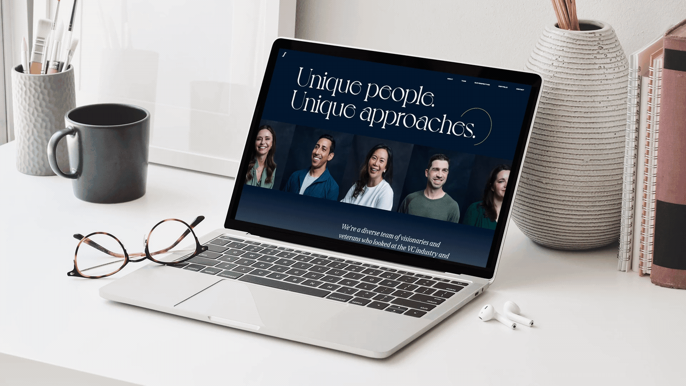
After reviewing and revising the sitemap, we began iterating on the site structure and visual design. One of the major findings from our research showed that the site visual styling was making it hard for people to discover content across the site, so in addition to a restructure, we also suggested a facelift in branding specifically for the website. This included using new font pairings that had visual interest and clear hierarchy, and also re-prioritizing color usage so that higher contrast colors were used to draw attention and visually guide users through the site. We also proposed new headshots for the team so the site had more visual consistency, which was also something lacking in the previous iteration.

Sketch to hi-fidelity
Developing site structure and developing visual style happened at the same time. After landing on the most successful site structure iteration, we applied the updated visual styling. Having the two work streams helped cut down on time, but we still had to iterate the higher fidelity prototypes in order to match form with function just right.


Outcomes
The client was pleased with the new structure of the site, and received compliments from other clients on their new visual style. They were appreciative of us pushing their design boundaries forward. The new site structure allows flexibility in adding and linking to owned content throughout the site. We have seen an uptick in users accessing articles about portfolio companies. The bounce rate from the portfolio page dropped as we moved the pertinent portfolio company information to a modal window, thus allowing users to stay where they were on the page. This window linked out externally as well as to other related articles, so the content connectivity of the site remained.

Typewolf Feature
In addition to some very happy clients, our website update was featured on the typography blog Typewolf, a site that highlights successful and interesting type pairings across the web.
Contributors